First off, I should confess I wasn't planning on making my website at first. I have a huge backlog of tutorials saved on my bookmarks and on one of my YouTube playlists. I guilted myself into doing a HTML 5 Canvas drawing app tutorial which was just a little bit of fun. Immediately after finishing I had my site open and HTML and CSS syntax fresh in my head. Time to get rid of that horrible page. Figuring out what I wanted the new site to look like though was too hard so instead I just cracked on with some web design tutorials and started to learn what I could do with what I knew.

"Under development" was a big fat lie for half a year.
The two most helpful tutorials I made use of were these two. For someone who was in my situation I can't recommend them enough. There are easier options out there most likely and what I learned was mostly from messing around with existing code and figuring out what each thing does. It's weird how it often comes down to that.
I'd like to say the way I do responsive design is awful. It's hard coded and I don't like it. As far as I know though maybe that's how a lot of sites do it. I handle a set of screen widths and if the device is a smartphone. This means screen widths that sit far between ones I have code for could get a bit weird. It also means any adjustments I need to make to a certain type of text such as h2 need to be adjusted in each media query as well. The way how my programmer brain imagines true responsive design is some javascript code in the background fully managing the sizes of all elements in relation to screen size by the value. Would the result look any better than what I've already made? Maybe not.
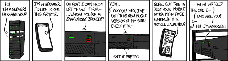
So what else did I hate? Not much really. As much as I know exactly how I would make a better website next time I consider my first crack at one fairly successful. I still find it pretty cool that my site adjusts content based on what screen type and size the user has. It's important to have responsive design and any site that doesn't have it looks outdated by at least 5-10 years. A site with it's own dedicated mobile site is just as bad.
Please no
Colour was hard to get right. I'm definitely not an artist and I've never got away with making anything that doesn't just assume a very inoffensive colour scheme. Sadly, my site is no different. I could only get a black/dark grey colour scheme to look professional. A few dashes of #FF8533 made at least some defiance against the dark and average style of the overall site. I think my css has 3-4 different colours in total which might also include just pure white. That's probably for the best.
What I found important was how I made the site. For the majority of the development I was using WebDisk which is a cool way to work on your site by having a network location on your PC be synced to your site. It works really well, when it works at all, which it only did for a few days. My FTP solution works in a similar fashion but isn't as fast or as elegant. This is what I found to enjoy most about web development though. I spent a few minutes doing something and then spent some time testing it. The same can't be said for larger projects where I might be coding for over an hour before even seeing a change. Seeing the product improve steadily is great for motivation. I'm aware I could just preview the site locally but I don't find it as cool. It also means I can't use sites like Responsinator which shows me what my site looks like on several popular screen sizes. It also means I can test on my phone and ipad.
One thing that might point out how much of a noob I was at this was I me copy pasting my home page each time I started a new site. I had 95% of the base HTML done before making different pages so nothing too bad but this obviously isn't the way to go. I imagine building templates to work with is a lot more professional and helpful in the long run. I also don't like that if I want to change something that affects all pages e.g the navbar I would have to manually change each HTML file. There has to be better way and I bet there is.
Overall I really like how CSS works. I really liked how one change on that style sheet would affect the whole site. I like Brackets. It's pretty good. I need to make use of the extensions next time and see if I can make my life easier. It's obvious that the coding style that I learned in first year of university when working with C# is definitely not popular with web devs. I like to make use of the vertical screen real estate as much as I can.
Anyway, my site is up and I don't plan on making any big changes for a while so please give me feedback because I feel like I'm still winging it. This has given me new found interest in blogging so I'm going to try and give more regular updates from now on.
No comments:
Post a Comment